Introduction to Data Visualization, Learn DAX and Power BI
The idea of this tutorial is to help anyone looking to learn DAX. DAX, as a subject, is a vast topic, and hence it will only be better to get started with some introduction and then learn DAX in parts.
In today’s post, we will learn some key concepts in DAX and slowly progress to understanding DAX’s uniqueness. We will broadly cover the following areas in this post about learning DAX:
- History of Data Visualization
- Role of DAX in interactive data visualizations and how it enables Power BI to create storytelling analytical dashboards
- Understand how Tabular Model and Relational Databases are similar and in what ways are they different from each other
- Comparing SQL and DAX
The point that needs to be emphasized is that, like any other programming language, you cannot master DAX overnight. It is essential for anyone starting to learn DAX, with a SQL background, should first understand the basics and get to the uniqueness of DAX and its functions.
Data Visualization
A simple definition of data visualization could be depicting data in a graphical or pictorial format that is visually easy to understand. Over so many years that BI and Reporting solutions have been implemented, there was a need felt to convey these insights from data in a way that anyone, right from a common man to a CEO, is able to understand just by looking at chart rather than browse through, read and understand what a report is trying to convey in its long-running pages with only tables, columns, and numbers.
This ability to be immediately able to connect with the audience and convey complex data split into smaller graphics has made Data visualization more powerful as it enables the audience to take relevant actions or decisions. It must be understood that Data Visualization is not merely using graphs and charts, but it is an art by itself and involves a scientific way to use the visualizations. There are many books available in the market that teaches the various techniques that can be employed to create stunning visualizations that tell data stories in a compelling manner that drives immediate decision making.
Some tips (this is not an exhaustive list though) to create meaningful visualizations are:
- Understand the Big Picture – know who your audience is and accordingly contextualize the setting
- Wear the hat of a UI/UX developer and think from a designer’s standpoint as to how to use UI/UX techniques that can create a connect with the audience
- Many times, less is more and make effective use of the real estate available and the color combinations to be more pleasing to the eyes
The Rise of Interactive Data Visualizations
While retaining the core concept behind data visualization, interactive visualizations take it to a different level by leveraging data modeling techniques and advancements in technologies to enable end-users to interact with the data. This allows a user to look at and analyze data from different angles. Users can drill down or drill through the data, all in the form of visuals, to the last granular level. This ability to drill down or drill through gives the power to explore, identify, and solve problems.
What is the Relevance of DAX?
The growth of data visualization and the emergence of interactive visualizations meant that expression languages, like the one we are familiar with in Excel, like DAX and its function, be utilized to provide a self-service mechanism to users to play and explore the data available for generating various insights. By effectively using the DAX and Storytelling techniques combination, a professional visualization expert can communicate information on one single page that even a multi-page report can sometimes fail to emphasize.
The emergence of Power BI
Power BI is a flagship product from Microsoft that provides Business Intelligence and interactive capabilities to users. Power BI can be used by businesses or enterprises irrespective of their sizes. It provides connectivity to a range of data sources to generate dashboards or reports using a simple drag and drop interface. Power BI enables data exploration with integration to tools like Python and R that are prominently used by data scientists and data analysts.
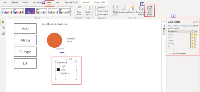
DAX, Power BI, and Tabular Models
Data Analysis Expression or DAX is an expression language primarily used in Power BI to query against Tabular Models. Power BI allows you to either create Tabular Models on the source data or connect to Tabular Models that have been developed using SSAS – SQL Server Analysis Services model.
In this blog series, we will make use of or refer to the AdventureWorksDW SSAS Tabular Model. This is a sample Database shipped along with SQL Server and will help anyone looking to learn DAX and Power BI. There are many links and posts within the Microsoft website to install this database, as you will need it to run any DAX queries against it to practice.
SQL Vs DAX – Similarities and Differences
In order to understand this, you must be familiar with how both the Relational Database and the Tabular model are different. If you come with a strong SQL background, then please understand that you might face some difficulties in the transition to DAX from SQL.
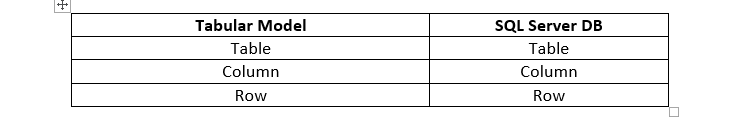
The Relational Database Vs the Tabular Model
In both the models, SQL (for Relational Database) and DAX (For Tabula Models) are used for running queries against Tables to fetch data, as you can see from the table below:
Now, your mind says both are the same and even when you open the DB and Tabular Model you will see that it is the same and have the same mapping of tables in AdventureWorksDW Relational Database to that of the AdventureWorksDW Tabular Model Database tables, as you can see in the image below.
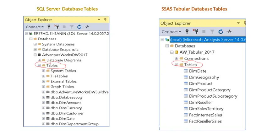
For the benefit of this post, we will restrict to just a few tables and the mapping of these tables are listed in the table below.
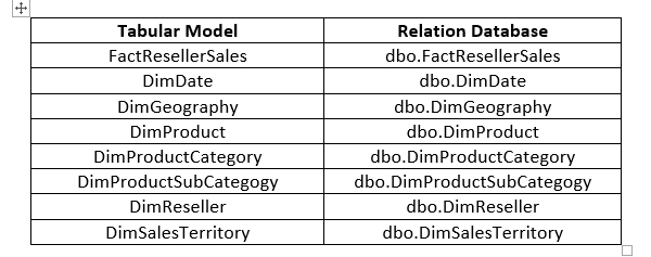
It is important to note that the table and column names should be the same when you create a Tabular model against a Relational DB.
Summary
In this post, we understood the evolution of data visualization and the techniques used. We saw the potential that the storytelling technique has and how effectively it can connect, communicate, and enable decision making from its audience. We also understood the prominence of Power BI and how it is slowly becoming a widely used tool in organizations of all sizes. Finally, we started to understand the similarities between Relational DB and Tabular Model.
In the next post of learning DAX, we will look at the differences between them.
You can start learning dax complete course online free.